|
Stardate
20021128.2123 (On Screen): On most of the large projects I participated in, the core of the design team would be electrical engineers, software engineers and mechanical engineers. The largest product I ever worked on would fit into the back of a pickup truck, and most of the products on which I worked could easily be carried by one person.
Except for when I was working on robotics, mostly what the mechanical engineers did was package design. They were trying to create enclosures for the hardware designed by the electrical engineers, which we software dudes then animated with our code. Given that the user interface was our responsibility, we'd work directly with the ME's to make sure that the keyboard (for instance) had the number and kind of controls on it that we required, laid out in a manner which made sense.
Package design is harder than it looks. It can be very challenging. The 1240 Logic Analyzer I worked on 20 years ago had to pass a suite of environmental tests that would reduce most equipment to rubbish (and most engineers to tears), and it was not uncommon for early prototypes to return from the environmental test lab in pieces in a box. For instance, if the product had a CRT, one of the tests involved a metal ball hanging on a cable which would be swung into the faceplate. If the CRT imploded, the design failed. Another interesting test was to strap the unit onto a shake table, which would vibrate it at high speed (sometimes as fast as 50 hertz) with a couple millimeter throw. If, after a couple of hours of such abuse, the unit would no longer function (because something inside had broken loose) then it failed.
It was also necessary to make sure that the equipment inside could be accessed for service but not any other time; to open easily when you needed to get in but not to open by accident. It had to survive significant static electrical arcs without frying the electronics. It had to be able to run in an oven. If it managed to survive all the shake, bake, and zap tests (and a bunch of others, like probing with the UL-standard "finger") then it got the environmental lab seal of approval, without which we were not permitted to ship.
But though we were designing things which were intensely utilitarian, that would only be used by the technically minded, there was always a wish to make the unit's look esthetically pleasing, within the limits which were possible given the functional requirements, and in addition to the three flavors of engineers we'd usually work with a industrial designer.
That is, in essence, an artist doing applied art and though he had to have a pretty good basic understanding of mechanical engineering so as to know what was possible (just as I as an embedded programmer have to understand electronics) he was not an ME. I've worked with several industrial designers and they're good folks; they're artists with their feet planted firmly on the ground. You don't see crap art, shock art, spectacle as a substitute for profundity here. They're interested in helping to make the product look good, but without sacrificing function. Function is always more important than beauty but they're not necessarily mutually exclusive, and the job of the industrial designer is to find the overlap.
I found this blog entry by Gideon Strauss where he talks about architecture, and it got me thinking about how I find most radical architecture to be really pretentious. Given my "a thing is what it does" pragmatism, it seems to me that an architect is to a civil engineer what an industrial designer is to a mechanical engineer working on packaging. Ultimately the goal of any building project is to create a structure which performs some useful purpose. (If not, then it's a sculpture and not architecture.) The goal of architecture, then, is to make a functional structure also be esthetically pleasing. The main difference here is that the architects usually wave the baton with civil engineers filling in the mundane details (which are myriad), and it's common for the budgets involved to be immense and the projects created to be huge and very noticeable. But I'm not sure I believe that this represents a difference in kind so much as one of degree.
In the pathological case, architecture begins to prefer the esthetic over the practical, and thinks more in terms of sculpture than of usefulness. If the first reaction someone has to the result is "That's beautiful!" rather than "That really works well!" then someone's not doing their job. What it sounds like from that blog entry and the article it references is that architecture may have become someone infected by the art-as-spectacle trend which led "modern art" into a cul-de-sac of increasing irrelevance and conceptual incest.
There are exceptions. There are cases where architects transcend that, creating designs which are not only stunning but also supremely practical. By far the best example of that I know of is Santiago Calatrava's Seville Bridge. It is beautiful; it is fantastically audacious. But it's more: it's also a better design than the alternatives on purely practical grounds.
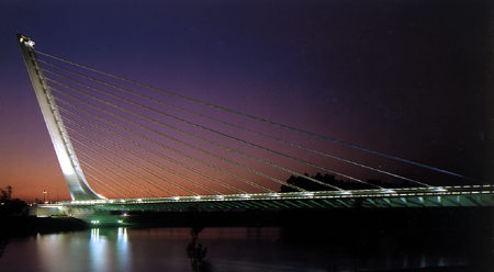
It's a suspension bridge 200 meters long, with the roadbed low to the water. The idea of using a single pylon, putting it on one end instead of in the middle, and slanting it is truly revolutionary.
A more traditional approach would have put a vertical pylon in the center. Then either there would be diagonal stays down to the road bed from both sides of the pylon, or vertical stays connected to a main cable extending from both ends and draping over the top of the pylon. The big problem with that is that the main pylon would have its foundation in the water, and construction of it would be much more difficult. With Calatrava's revolutionary concept, the foundation for the pylon is on dry land, and that would make construction far easier.
The Golden Gate is a suspension bridge, and what makes that complicated is that each end of the main cable has to be anchored. The anchorages at each end are actually the size of small office buildings, made out of concrete heavily laced with steel and together weighing 120 thousand tons. They've got to be that big, because the lateral force on the cable at each end is mammoth. If the end points give way because the anchorage slips, the bridge will fail. It takes that kind of structure to deal with huge lateral forces.
The seeming advantage of a central pylon is that the lateral forces on it are balanced so that most of the force is straight downward. The initial expectation would be that an offset pylon would be subject to a lot of lateral force thus requiring a very elaborate and expensive foundation, and what you gained by moving onto dry land you'd more than give away again by dealing with lateral force one way or another. Calatrava solved that problem brilliantly by making the pylon lean.
Because the pylon is slanted away from the bridge, the force of gravity on the pylon creates lateral force to the left in the picture above. The cables extending down to the roadbed which hold it up carry lateral force to the right, and the two forces largely equal one another, resulting in a structure which is balanced on top of the pylon foundation.
When I first saw this it gave me a slap-the-forehead why-didn't-I-think-of-that reaction that I always get from what we engineers refer to as "elegance" (which is not easily explained to laymen). I was simultaneously stunned by how gorgeous it was and by the practicality of the design from an engineering standpoint. This represents architecture at its best, where the esthetic aspects of the design also serve, and indeed facilitate, the function. The ideal in civil engineering is to create a good design which serves well and which costs as little to build as possible, and this does. Other approaches would actually have cost more as well as being esthetically less pleasing.
Calatrava is a genius; he's widely regarded as the most innovative architect working today. And I find his work far more pleasing than I do many other leading architects, and almost the diametric opposite of being pretentious. His work does impress, but I don't think that's his primary goal. But that's because Calatrava is more engineer than artist, in practice even if not in credentials. He isn't a sculptor working in the medium of large construction, he's more like an engineer with an amazing artistic sense. He's first and foremost interested in designing things that work, and then in trying to make them beautiful at the same time. To a great extent what he's really doing is to find revolutionary concepts in civil engineering more than in architecture as such.
Architecture must be practical before anything else. If a lot of radical architecture I've seen is a failure, at least for me it's been because the architect sacrificed function for the sake of art.
Update 20021129: Of course, I could be wrong (about Calatrava). Jesus writes from Spain:
Being in Spain, I've had the opportunity to visit his works. I noticed Calatrava seems to follow a single guiding principle while designing, and he seems to go out of his way to not violate that principle. It is: "Nothing vertical, nothing horizontal". In other words, everything has to be slanted. If something has to be horizontal or vertical, then it can never be straight, but curved or twisted it seems to be OK.
That's the genius part: to find a principle that entrances his clients in a consistent manner. He did it and now he deserves fame and fortune. But some of his works have been embarrassing failures.
Let me tell you about one of the failures of Calatravan design: the Zubizuri footbridge, in Campo Volantin street, Bilbao (Spain).
When I first visited Bilbao, the locals advised me not to tread on that footbridge, it has a bad name.
Once I dared to cross it, its main defect was painfully obvious: Calatrava slanted the very floor of the footbridge; it's not horizontal. While crossing it, I felt a little dizzy, and with the strange sensation of being about to fall. Besides, the floor is made of glass, and the river is visible through it. That only increased the falling sensation. When wet, it is quite slippery (some locals refer to Zubizuri as the 'slippery footbridge'). Several elderly persons actually fell and got their bones broken while crossing Zubizuri.
The bridge in Seville that you mention is called Alamillo. Calatrava wanted to build a pair of bridges, but the second was never built, due to the insane cost of the first.
Once again, Calatrava designed a beauty, but could not envision how it would be built. His idea was infeasible, and the contractor had to build the deck and road first, and the tower and cables afterwards. Somebody argued that its the deck which prevents the tower from falling, and not the opposite ;-) You can read about that here.
Now, once built, the thing is gorgeous. I have no words to describe to you what I felt when I crossed the bridge by car (from right to left in your photo). Of course, the sensation was different when I crossed it the other way.
Another demi-failure of Calatrava is the Sondika-Bilbao airport, which I also visited. The exterior is quite nice, but the inside is way better. If you depart from Bilbao, you check your luggage inside the big pointy structure you see in the photos, which is huge. It's made out of many slanted beams resembling the bones of some humongous animal that just swallowed everyone. The luggage claim area has its ceiling crossed from side to side with several curved beams which resemble the ribs of a whale. I felt I was Jonah. Breathtaking, at least the first time.
¿What's the problem then? That's no airport, it feels like a museum. There is flat glass between beams, and the reberveration amplifies the background noise. Passengers can't understand what is said over the loudspeakers. Since everything is slanted, big rectangular vertical thingies destroy the whole atmosphere, so the big information panels are in the check-in area; those in the cafeteria have to check departures in a tiny monitor. When I tried to find my gate, I had a hard time, because the signs with the gate numbers are also tiny (undoubtedly to preserve the atmosphere, usability be damned). But the worst is felt by incoming passengers: they have to get out to wait for a taxi, under a slanted structure that offers scant protection against wind and rain, all too common in the city. I've talked to people that uses the airport once a week, and some of their opinions are unprintable.
About a year ago, the ministry of public works (owner of the airport) asked Calatrava to redesign the exit to avoid the soaking and freezing of passenger, and he refused. The minister then chided him in the media, and said that if Calatrava would not do it, other architects would love to do it. Then Calatrava threatened to go to the courts to prevent any redesign of 'his' airport. The minister, predictably, told him it was not 'his' anymore.
In a nutshell: my experience is that Calatrava designs are great from a distance, but not very functional, even when they have to be (and he does not care much). That's why I send you this. I agree with you in the importance of usability, and that's why I am glad Calatrava lost the bid to build the new Madrid airport, and that the winning design (by Rogers & Lamela) is completely horizontal, with no stairs.
It would seem that Calatrava is actually a bad example, not a good one, showing someone who is working on grand sculpture and not letting function rule.
include
+force_include -force_exclude
|